
Throughout my entire career, including now being a small fleet owner, I always made sure the way I branded my company conveyed what I wanted my business to be known for. From the beginning, a lot of time and thought went into what I named my company and what logo I would draw up to represent it. Not that I expected it in the initial brand creation, but my branding has also brought with it some chuckles here and there, and has even been rebooted in order to focus on the true meaning of where I saw my company going in the future.
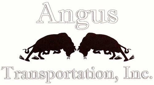
With my original logo, two bulls squaring off head-to-head, getting ready to lock horns, the company name of Angus Transportation, Inc. seemed fitting. Wanting a strong animal to represent the strength of my company was one of the early things I decided upon. Truth be told though, being an AC/DC fan didn’t hurt when it came to narrowing it down to “Angus” as the name either! The logo took another symbolic approach when I decided to square them off head-to-head in a charge stance, as I am always one to charge at a challenge head on.
As the saying goes though, “If I only knew then what I know now”, I may have changed a few things in my company branding, just to avoid some of the comments or questions I got from time to time. I would have a huge pile of nickels for every time I’ve been asked, “Do you haul beef?” or “You know true Angus don’t have horns, right?” To these I usually answer in succession that we don’t haul beef because we have no reefers, and a charging bull with no horns just doesn’t look right. Though I do not have regrets about my choice, just use this as a reminder to think carefully about what you brand yourself as and what logo you choose.
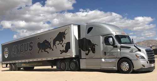
As my company began to grow from the original one truck-one trailer operation I set out with on my own, I decided with a little marketing and artistic input that it was time for a change. The focus of my business was not so much about butting heads with challenges anymore, so much as it had become charging forward to blaze a new trail of fleet expansion. When the artwork came in for the new Qwik Zip banner system for my trailer, it could not have been more perfect! Larger than life and strewn across 53’ of trailer, three bulls charged forward one after another blazing a trail forward into the unknown! This sparked the rebranding of my logo to forward-charging bulls, symbolizing our close knit family of drivers working as a team to trudge through new territory and gave birth to the goal of fleet expansion through cooperation and transparency practiced every day.
A brand is as powerful as you make it, but only works if you live up to its representation and symbolism. It should encompass your goals, vision and scope and be referenced often to keep you in check with the goals you set out to accomplish during its creation. A lot of people use their last name in their branding, which there is nothing wrong with and can bring a sense of pride to the owner, but you may get lost in the masses more easily. A lot of our shippers and receivers know our name and always know the trucks by the bull decals on the doors. We even get treated with a certain preference at some places just because one of our other trucks may have been there before and we get recognized, remembered, and even welcomed based on the professionalism and hard work behind the brand. Make your company stand out and be remembered by properly branding yourself! Big or small, proper branding matters to all!