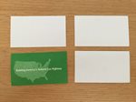
 When networking, or reaching out to new customers, it is more often than not that the people shaking hands and making deals are often left with a business card or other promotional material to remember one another by. The business card is by far the most prominent way to leave your mark on someone you are meeting in the business world for the first time and an important way of conveying your contact information for future reference. Occasionally I will sift through stacks of cards that I accumulate while out on the road and networking at trade shows to refresh contact lists and put them in a safe place for future reference. It was during a recent sift that I decided to look into what, out of all these cards I accumulate, truly makes them stand out to me and incorporate these characteristics into a new business card for myself.
 |
| Card Fronts |
 |
| Card Backs |
At first glance, I noticed a great majority of the most professional cards I had in my possession were on white cardstock to begin with. Only a few of them were on color stock, which even fewer still out of those were on darker colored backgrounds. This is a common design I have seen, which is used to provide the best contrast for names and logos and a clean look for presentation purposes. This has always been something I try to incorporate, which is why my business logo has always been all black on a white background, for maximum contrast. I narrowed it down to a few of the more professional cards in my stack that stood out as some of best and broke them down a little further. A great deal of card space was given to the logo itself on those pictured here, which makes sure the focus is to make people recognize the brand or business name. All feature a bold name for the cardholder and clear, easy to read fonts. Only one of these had anything on the back, which was a slogan for Clean Energy, which helps people recognize the card from both sides and provides a way to add more information without cluttering the front of the card.
 |
| Old Card |
 |
| New Card Front |
 |
| New Card Back |
Not that my old business card was all that bad to look at, with a beautiful Freightliner Cascadia adorning the card front-and-center! In an effort to create my own business brand recognition, I decided it was time to move to a more recognizable, logo-based design. I felt the old one did not include enough information and that the text got lost in the beautiful evening sunset background I had originally chose. Here you can see that I have taken professional elements from some of my favorite cards and incorporated them into a cleaner, more professional looking card to represent my trucking business. The new card is much cleaner looking, with my black logo design, on white glossy cardstock, with easy to read back and front printing. It is important that you think over card designs very seriously for your business when that time comes. If you are handing over your card to someone you’ve just met with any though in your mind that it is not the absolute best representation of your business, then you may be due for a re-design. Taking the small amount of time to re-think some design elements of your business cards ultimately may be the difference between it ending up in someone’s contact list or their trash can!